


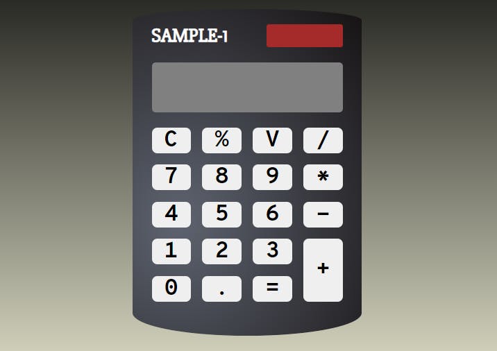
Building your own calculator is a challenge most of the web developers meet after a few months of studying. A couple of weeks prior to writing this post I took a challenge, too. The final result was pretty satisfying to me, I also learned much by doing it. Today I wanted to describe the styling process I went through. Live version of the calculator is available at Codepen or at GitHub.
Prerequisites:
- Basic to Advanced CSS/HTML knowledge
- Any photo editor with color pick tool
- (Optional) Basic familiarity with Figma
I want mention that I'm not a professional developer or an artist, so there may be better approaches to what I did. First, we need some structure (I won't be including all of the buttons here) and basic styling.
<body class="body">
  <div class="calculator">
    <div class="calculator__top">
      <div class="calculator__heading">
        <h1 class="calculator__title">SAMPLE-1</h1>
      </div>
      <!-- Containers we'll need later -->>
      <div class="calculator__sun-container">
        <div class="calculator__sun-battery"></div>
      </div>
    </div>
    <div class="calculator__screen-container">
      <input type="text" class="calculator__screen">
    </div>
    <div class="calculator__keyboard">
      <button type="button" class="button">C</button>
      <button type="button" class="button">%</button>
      <button type="button" class="button">V</button>
      <button type="button" class="button">/</button>
      <button type="button" class="button">7</button>
      <button type="button" class="button">8</button>
      <button type="button" class="button">9</button>
      <button type="button" class="button">*</button>
      <!-- etc -->
    </div>
  </div>
</body>
I'm not using id's, because I'm working with BEM naming, but it is a topic for another discussion.
.body {
  padding: 0;
  margin: 0;
  height: 100vh; /* For fixed centered alignment */
  display: flex;
  align-items: center;
  justify-content: center;
  background-image: linear-gradient(to top, beige 0%, black 100%);
  background-attachment: fixed;
}

.calculator {
  width: 300px;
  min-width: 300px; /* Shrinks on lesser resolution */
  box-sizing: border-box;
  padding: 20px;
  background: black;
  border-radius: 20px;
  color: white;
}

.calculator__screen {
  background: grey;
  width: 100%;
  display: block;
  box-sizing: border-box;
  border: 0;
  text-align: right;
  font-size: 40px;
  padding: 10px;
  border-radius: 5px;
}

.button {
  font-family: inherit; /* Inputs don't inherit by default */
  font-size: 30px;
  border-radius: 7px;
  border: 0;
  padding: 0;
  display: flex; /* Not necessary for now */
  justify-content: center;
  align-items: center;
  outline: none;
}
Let's add a grid
.calculator__keyboard {
  display: grid;
  grid-template-columns: repeat(4, 1fr);
  gap: 15px;
}
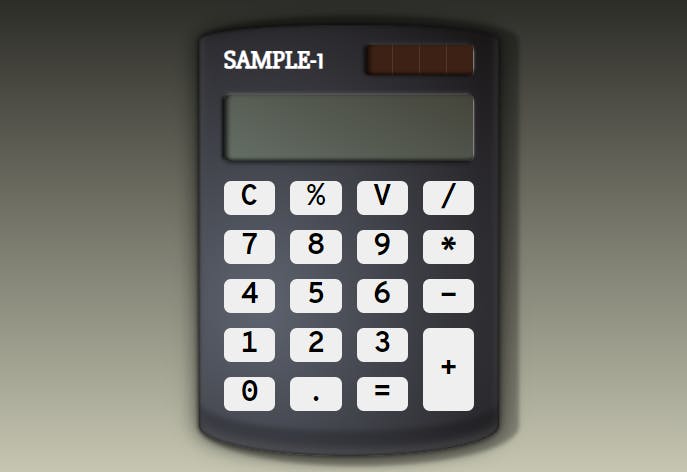
Our result so far:
 A good idea is to use normalize.css and custom Google fonts. I used Overpass for buttons, Slabo for the header and Share Tech for the screen.
  <link rel="stylesheet" href="./normalize.css">
  <link
    href="https://fonts.googleapis.com/css2?family=Overpass+Mono:wght@700&family=Share+Tech+Mono&family=Slabo+27px&display=swap"
    rel="stylesheet">
.calculator__heading {
  font-family: 'Slabo 27px', serif;
}
Let's make a flex out of the calculator top (for correctly aligning the title and the sun battery in one line), remove the default margin from h1 element, make the battery visible and add some margins to the screen.
.calculator__top {
  display: flex;
  justify-content: space-between;
  align-items: center;
}

.calculator__title {
  margin: 0;
  font-size: 25px;
}

.calculator__sun-battery {
  width: 100px;
  height: 30px;
  border-radius: 3px;
  background-color: brown;
}

.calculator__screen-container {
  margin: 20px 0;
  border-radius: 5px; /* For later */
}
Looking good! Let's add a custom class to "+" button to span it across two grid rows.
.button_type_plus {
  grid-row: span 2;
}
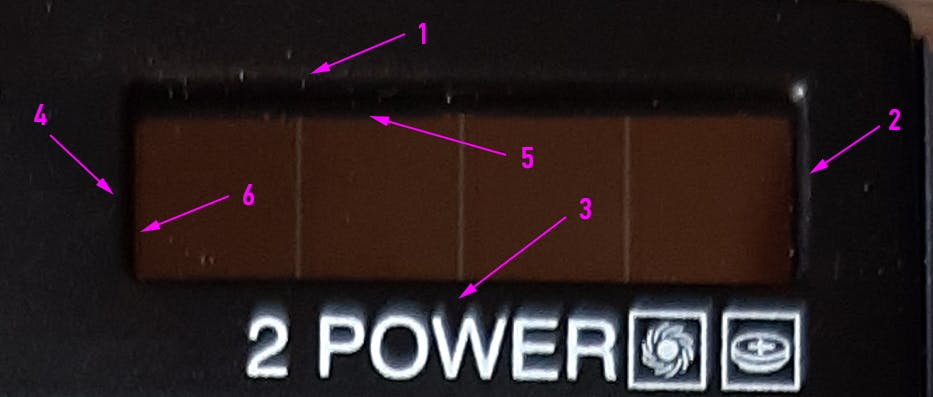
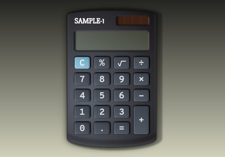
Okay, we're done with the basic structure, now the shadow magic begins! First, you need to study the object you're trying to recreate. A calculator is great in that regard, because it doesn't have a complex shape, and it can be recreated without much struggle. Second, you need a photo with distinguished light and shadows (it will make our challenge much easier). Here's the photo I took:
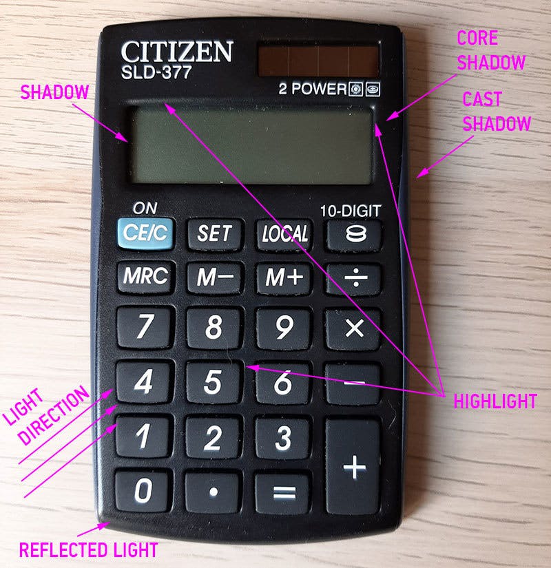 I won't go into art theory now, just know that you don't need to recreate everything exactly (if it is not your mission).
First, let's add a shape and paddings. Border-radius can be added to each corner separately, which allows us to create shapes in CSS. I won't go into much details (search MDN), but imagine an ellipse with width of a 100% of our calculator and height of 60px (30px radius * 2) - this will be the shape of our top.
.calculator {
  padding: 20px 25px 45px;
  border-top-left-radius: 100% 30px;
  border-top-right-radius: 100% 30px;
  border-bottom-left-radius: 100% 60px;
  border-bottom-right-radius: 100% 60px;
}
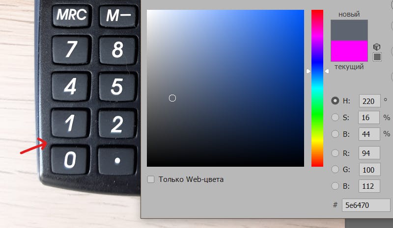
It's time to pick colors for calculator's body! Open the photo in an editor and use a picker to choose the brightest and the darkest parts of the case, then add them to the .calculator background property. You may use linear-gradient, but I chose radial-gradient which spreads from the center to the farthest corner, the center is at 20% on x-axis and 65% on y-axis based on the width/height of the calculator element.
.calculator {
  background: radial-gradient(ellipse farthest-corner
    at 20% 65%, #5e6470, #161213);
}
We see some progress!
Let's start with the sun battery. First, we need a background. I picked it from the photo, didn't use a gradient here. Vertical lines achieved by repeating-linear-gradient function (you can study it at MDN). Needed to fix battery width, too.
.calculator__sun-battery {
  width: 107px;
  height: 30px;
  border-radius: 3px;
  background-color: #3d2115;
  background-image: repeating-linear-gradient(to right,
      transparent,
      transparent 26px,
      rgba(255, 255, 255, .1) 26px,
      rgba(255, 255, 255, .1) 27px);
}
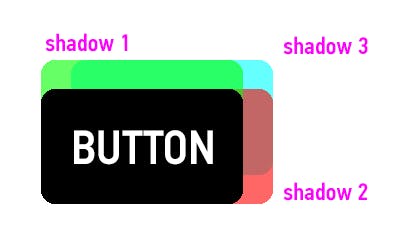
How do we add shadows? If you look at the object (it's better seen live), there are six sides we can apply shadows and highlights to (inner and outer). Let's start from the top clockwise, as CSS properties usually do.
.calculator__sun-battery {
  box-shadow: 0 -3px 5px -3px rgba(255, 255, 255, .2),
              5px 0 3px -5px rgba(255, 255, 255, .8),
              0 2px 5px -2px rgba(0, 0, 0, .5),
              -3px 0 3px -1px rgba(0, 0, 0, .8),
              inset 0 -5px 3px -3px rgba(0, 0, 0, .5),
              inset 5px 0 5px -2px rgba(0, 0, 0, .8);
And it's working! Let's see in details.
We're adding box-shadows in multiple layers. First, we're setting two coordinates - x and y. '0 -3px' means the shadow will move 3px upwards. Next value '5px' is a blur radius, the lesser it is, the sharper a shadow would be. Fourth value -3px is a spread radius. Negative values will shrink a shadow, and I'm using this behavior actively. Lastly, there is a color of shadow with opacity value. rgba(255, 255, 255, .2) means pure white color with 20% opacity (maximum value for opacity is 1).
So, we've added a slightly visible highlight to the top, a notable highlight to the right, and inner/outer shadows to the left and to the bottom. The rule is that the strong highlight should be on the opposite side of the strong shadow.
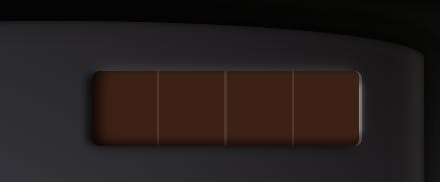
Lastly, we may add a right border to the screen battery container to make a highlight more distinctive.
.calculator__sun-battery-container {
  border-radius: 3px; /* To fix border overflow */
  border-right: 1px solid rgba(255, 255, 255, .2);
}
Let's move to the screen. First, let's make a nice linear gradient background using the same color picker trick we used before. Then let's copy the entire box-shadow property from the sun battery and start to modify it. It might take some time to find optimal values.
.calculator__screen {
  background-image: linear-gradient(-155deg, #44443a 0%, #656f66 100%);
  box-shadow: 0 -4px 4px -3px rgba(255, 255, 255, .3),
    5px 0 3px -5px rgba(255, 255, 255, .8),
    0 5px 5px -3px rgba(0, 0, 0, .5),
    -3px 0 3px -1px rgba(0, 0, 0, .8),
    inset 0 -5px 3px -3px rgba(0, 0, 0, .5),
    inset 5px 0 5px -2px rgba(0, 0, 0, .8);
}
We may add a border-right to calculator__screen-container, like we did before, or we may modify the second box-shadow for a brighter highlight. I also added letter-spacing: -2px; for the screen to put numbers closer to each other.
If you are writing a script for the calculator, a good idea is to add disabled property to html input element to prevent direct input and disable outline. Then, you can add calculator__screen:disabled class to the css to modify a font color.
Let's work on the calculator body. There are multiple shadows I've added.
.calculator {
  box-shadow: 0 0 5px 0 rgba(0, 0, 0, .7),
    0 0 20px 0 rgba(0, 0, 0, .5),
    0 0 25px 0 rgba(0, 0, 0, .3),
    10px 0 4px 10px rgba(0, 0, 0, .3),
    inset 0 0 3px 0 rgba(0, 0, 0, .7),
    inset 0 0 10px 0 rgba(0, 0, 0, .5),
    inset 0 -25px 5px 0 rgba(0, 0, 0, .2),
    inset 0 -5px 10px 0 rgba(255, 255, 255, .3);
}
The first three shadows create a 3d effect around the calculator. This practice with a few gradually spreading and less visible shadows is widely used (for text effects, for example, although it would be text-shadow property). Forth is a moderately sharp cast shadow to the right of the calculator (I imitated what I've seen on the photo). Next two insets create a 3d effect inside the calculator. The inset before the last creates a bottom edge. The last one is a bonus (it's barely seen on photo, so I've added it myself) - it creates a nice reflected light at the shadow sides of the calculator. You can even match it with the background, which will make it even more realistic.
Okay, a few more things to do...
I did not change the shape of buttons, but with CSS everything is possible! In my original calculator, I've added a height to grid-rows, so the upper buttons would be a bit smaller than the number buttons. Here, we'll use auto-rows. Also, I used a bit of opacity on the font. And don't forget the linear-gradient! Here's how it looks like:
.calculator__keyboard {
  display: grid;
  gap: 15px;
  grid-template-columns: repeat(4, 1fr);
  grid-auto-rows: 40px;
}
.button {
  background: linear-gradient(25deg, #525a65, #3b424c);
  color: rgba(255, 255, 255, .8);
  box-shadow: inset 2px -1px 1px 0 rgba(255, 255, 255, .2),
    inset -3px 2px 5px 0 rgba(0, 0, 0, .2),
    4px 1px 1px 0 rgba(0, 0, 0, .5),
    -1px -3px 1px 0 rgba(0, 0, 0, .5),
    4px -3px 1px 0 rgba(0, 0, 0, .5),
    -1px -1px 5px 0 rgba(0, 0, 0, .5);
}
The first inset creates a highlighted sharp edge of the button. The second one is for a slightly visible shadow on the opposite side. The next three used for a deep shadow around the top and the right sides of the button. I used three of them to cover a bigger area. The last one creates a small black outline from the direction of light (bottom-left).
 The finishing touch would be adding a key press effect for the buttons. We're using :active selector for this.
.button:active {
  box-shadow: inset 2px -1px 1px 0 rgba(255, 255, 255, .2),
    inset -3px 2px 5px 0 rgba(0, 0, 0, .2),
    3px 1px 1px 0 rgba(0, 0, 0, .5),
    -1px -1px 1px 0 rgba(0, 0, 0, .5),
    3px -1px 1px 0 rgba(0, 0, 0, .5),
    -1px -1px 5px 0 rgba(0, 0, 0, .5),
    4px 0 1px 0 rgba(255, 255, 255, .3);
  transform: translate(1px, -1px);
}
 Basically, I'm making the deep shadow shallower while moving the button 1px up and right (transform property). A nice touch is the first inset - while button pressed, it creates a small highlighted edge on the right side outside of button. It's barely noticeable, but it adds points to the realism.
And that's it! What else can we do to move closer to perfection?
- Play with font sizes and paddings for the buttons - currently, they are not centered.
- Add color to some buttons by changing the values in linear-gradient for the background.
- Change button titles to symbols, such as '÷' and '×'.
- For the 'square root' and 'backspace' symbols of my original calculator, I used Figma (you should try to learn it). I created two shapes, exported them as SVG and pasted them inside the code. (It's better practice to set width and height for SVGs in CSS, not in HTML.)
<button type="button" class="button">
<svg class="square-symbol" viewBox="0 0 33 23" fill="none"
  xmlns="http://www.w3.org/2000/svg">
  <path d="M2 10l5 11h2.5l6-19H33" stroke="#fff"
    stroke-width="3" />
</svg>
</button>
Links
- Box Shadow Property (MDN)
- Linear Graident (MDN)
- Repeating Linear Gradient (MDN)
- Radial Gradient (MDN)
- Border Radius (MDN)
- Using CSS Gradients (MDN)
- A complete guide to grid
- A complete guide to flexbox
- Normalize.css
- CodePen (Search for 'calculator')
Hammer and wrench photos credited to iMattSmart Old cash register photo credited to bruno neurath-wilson