

Modals (or popups) are one of the most popular interface elements a beginner developer should be able to build (as well as carousels/sliders, for example). There are many ways to do it, manual and automated, today I will teach you how to create a popup on HTML, CSS and JavaScript step-by-step.
HTML & CSS
First, let's create an index.html and connect an empty style.css sheet to it. In VSCode, you can do this quickly by typing ! and pressing Tab in HTML file.
<!DOCTYPE html>
<html lang="en">
<head>
  <meta charset="UTF-8">
  <meta name="viewport" content="width=device-width, initial-scale=1.0">
  <title>Popups</title>
  <link rel="stylesheet" href="style.css">
</head>
<body>

</body>
</html>
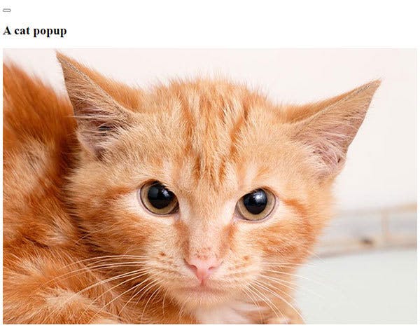
Next, we're adding a basic popup layout. I'm adding a future close button (we will modify it later), a title, and a very cute cat picture. Don't forget to fill in the alt attribute when inserting images! I'm already setting up class names for all elements (I'm using BEM naming, but it doesn't really matter how do you name them now).
<body>
  <div class="popup">
    <div class="popup__container">
      <button type="button" class="close-button"></button>
      <h2 class="popup__title">A cat popup</h2>
      <img class="popup__image"
       src="https://i.imgur.com/CYJ0KLR.jpg"
       alt="A cute cat">
    </div>
  </div>
</body>
Not much to look at for now, except a very cute cat.
Let's do some styling! I'm adding a zero margin to the body (I recommend using normalize.css for optimizing your page across different browsers) and setting semi-opaque black background to the popup. The popup becomes fixed with its edges glued to a window's edges. For centering the content, I'm making popup a flex container. I'm also adding z-index property, so the popup would be above all other content of the page.
body {
  margin: 0;
}

.popup {
  position: fixed;
  top: 0;
  bottom: 0;
  left: 0;
  right: 0;
  z-index: 1;
  display: flex;
  background-color: rgba(0, 0, 0, .5);
}
Time to add a new font to our project! Visit fonts.google.com, choose a font and a style, embed the link into your HTML head section, then add a font-family to the whole page, or to the popup specifically.
<link href="https://fonts.googleapis.com/css2?family=Inter:wght@900&display=swap" rel="stylesheet">
body {
  margin: 0;
  font-family: 'Inter', sans-serif;
}
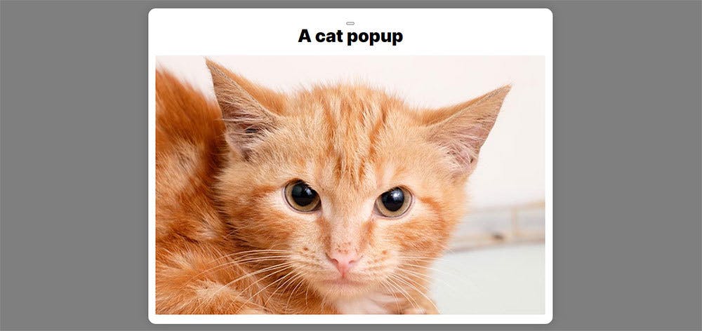
Styling the popup a bit more. Let's make a title bigger and remove its margins, except the bottom one. For the popup__container I chose white background, a small box-shadow to make a 'floating' visual effect, and a few more tweaks. Margin:auto positions it at the center of the flex-box container. Position:relative will make it possible to position the close button inside the container.
.popup__title {
  font-size: 36px;
  margin: 0 0 18px;
}

.popup__container {
  background-color: #fff;
  box-shadow: 0px 0px 25px rgba(0, 0, 0, 0.15);
  border-radius: 15px;
  text-align: center;
  margin: auto;
  position: relative;
  padding: 15px;
}
Looks better already!
Let's make the image responsive by adding a max-width and a max-height properties connected to the screen size (vw and vh are the percentages of a screen width and height).
.popup__image {
  max-width: 60vw;
  max-height: 60vh;
}
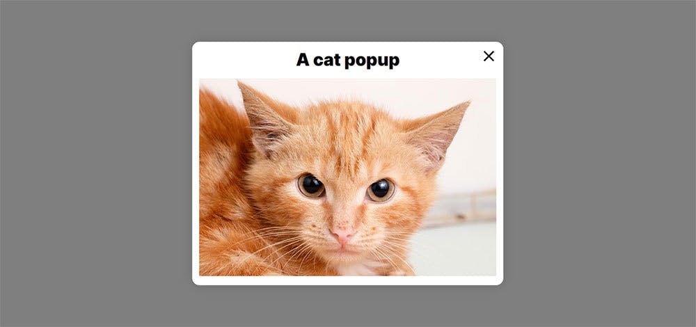
For the close button I used this SVG, but you can draw it yourself in Figma, or use a picture, or even draw it in CSS. First, I positioned it in the top-left corner and removed a border. Then I added an SVG picture as a background, centered it, set its dimensions at 100% and made it non-repeatable. At last, I set its size and filled it with black (you should remove a fill property from the SVG itself, if it has any). Here are the styles:
.close-button {
  position: absolute;
  right: 10px;
  top: 10px;
  border: 0;
  background: url('./button-close.svg') center center / 100% 100% no-repeat;
  width: 40px;
  height: 40px;
  fill: #000;
  padding: 0;
  cursor: pointer;
  display: block;
}
That's it for the visuals. You can experiment some more, for example, by making a title responsive, or by adding a transition effect for the button, etc.
JavaScript
Let's make an empty script.js file and connect it in the bottom of index.html, above </body>.
<script src="./script.js"></script>
Also, we need a simple button for opening our popup. Place it after the popup div.
<button class="popup-button">Call cat</button>
.popup-button {
  margin: 30px;
  padding: 10px;
  font-family: inherit;
}
Make a popup invisible, and add another class for making it visible. We will be adding it by JavaScript. I'll explain the opacity moment in a bit.
.popup {
  ...
  visibility: hidden;
  opacity: 0;
}

.popup_opened {
  visibility: visible;
  opacity: 1;
}
Let's find the popup and two buttons in script.js using querySelector.
const callButton = document.querySelector('.popup-button');
const popup = document.querySelector('.popup');
const closeButton = popup.querySelector('.close-button');
Let's make a function which toggles the popup_opened class for our popup and then add a listener for the call button, which would trigger that function. Yay, it's working! Take notice that in query selector we used a dot '.' to select a class, but in classList.toggle no dot is needed.
popupToggle = () => {
  popup.classList.toggle('popup_opened');
}

callButton.addEventListener('click', popupToggle);
Adding a listener with the same callback function for the close button will make it functional, too!
closeButton.addEventListener('click', popupToggle);
Now for the opacity part: add this line to a .popup class to make a smooth opening and closing effect of the popup. This wouldn't be possible with visibility transition only.
.popup {
  ...
  transition: visibility 300ms, opacity 300ms;
}
And we're done!
Bonus part
But here's something extra! How can we make a popup closed by clicking outside of the popup_content? And the solution is: we will utilize the JavaScript event interface. I won't go into much details here, but you should know that event is created every time something happens in the DOM. In our case - we are clicking something, and we will be clicking a popup's dark area.
First, we're adding a listener to the popup itself. The callback function would be processing that click. We're not adding any output arguments, but we're adding a parameter event in function expression (as I was saying, the event would be created in any case). The next step is to check where the click had happened. Event.target property points to an element which we clicked on - a button, a title, a picture - any child of an element which has a listener on. Event.currentTarget points to an element which has a listener set on. This is a simplified explanation, but in our case we need to know if what we clicked is exactly the popup (a dark space), not its content. So, if that is true, we're just calling the toggle function. Here's the code:
closeOnBlack = (event) => {
  if (event.target === event.currentTarget) popupToggle();
}
popup.addEventListener('click', closeOnBlack);
Thank you for reading! I appreciate any feedback or sharing of this post! In one of my next blogs I'll explain one of the ways to work with multiple popups.